Independent Los Angeles Label
Translated a distinct brand system into a Shopify storefront with custom architecture and release-focused merchandising.
Open the live demo — Independent Los Angeles Label, opens in a new tab
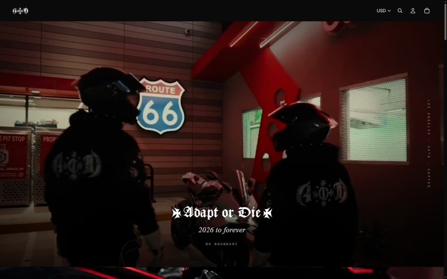
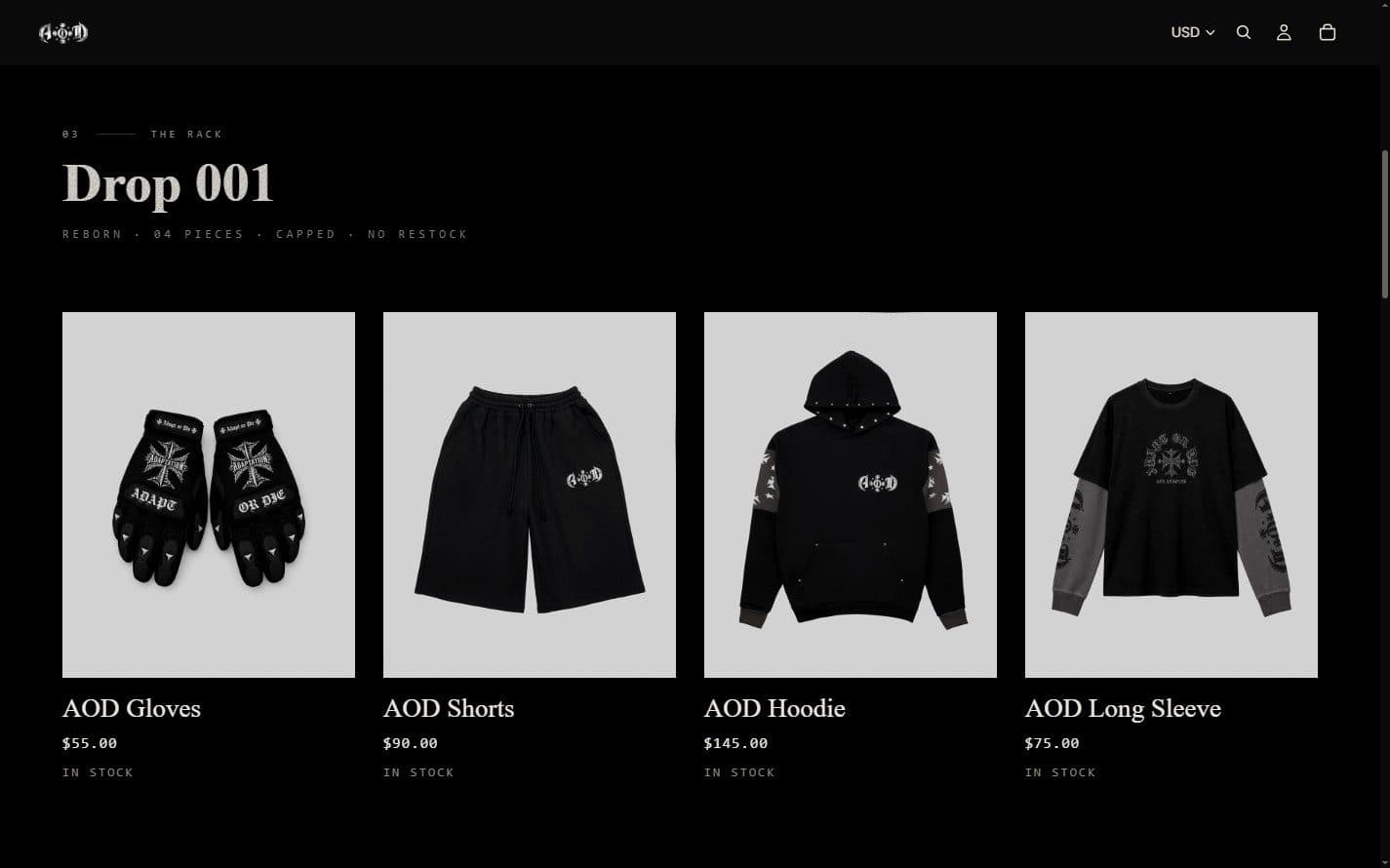
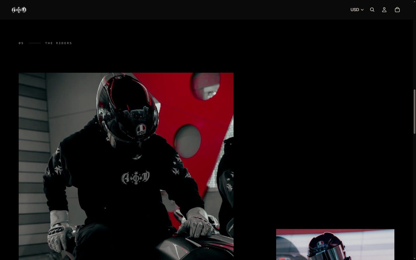
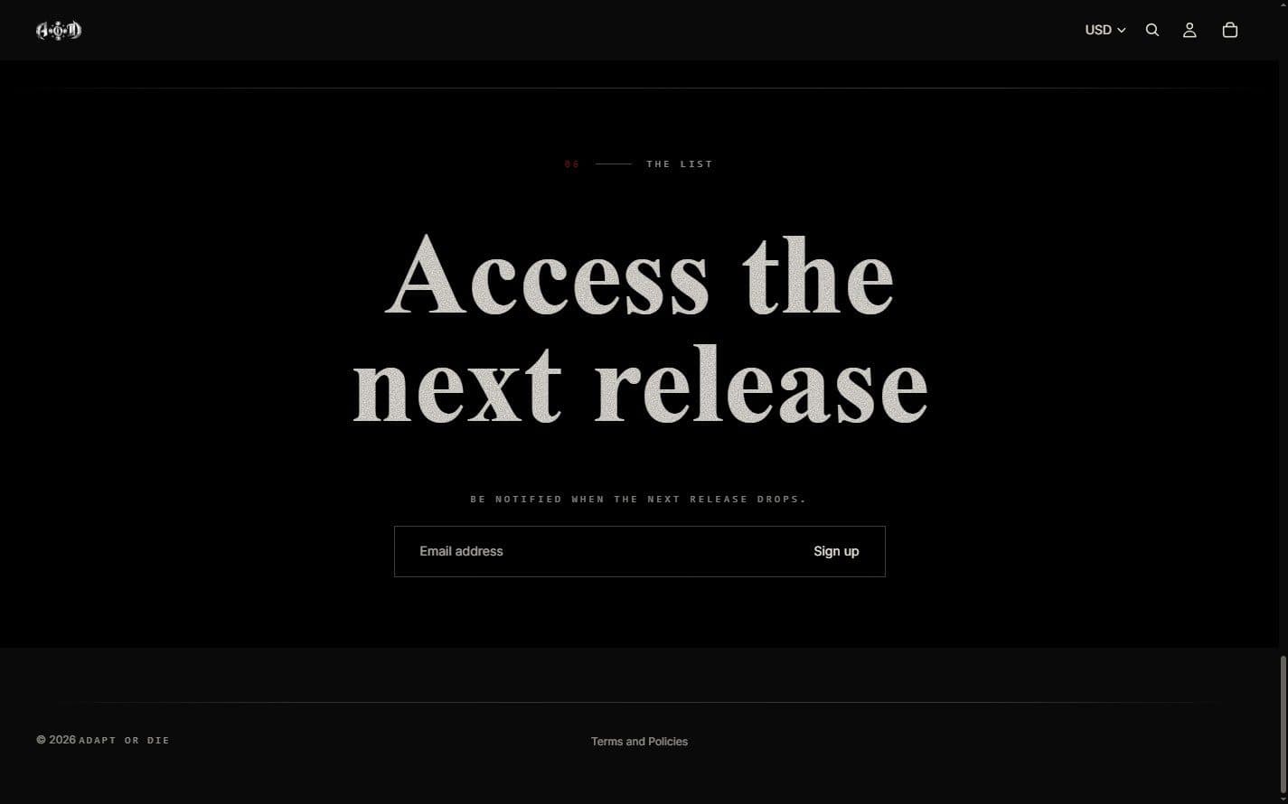
An independent Los Angeles apparel label with a deliberately narrow visual register — blackletter display type, near-total blackness, a single accent, and copy written as chapters rather than as product marketing. The release is composed as a sequence of numbered chapters rather than as a catalog: a film-led opening, the drop itself as one flat row of uniform plates, a campaign study, and a closing list in place of a checkout. The work covers the brand direction, a Next.js storefront, and a port of the same brand layer onto a Shopify theme, which is what the demo opens.
- Brand Direction
- Storefront Architecture
- Shopify Theme Development
- Editorial Art Direction
- The chapter marks run 03, 05, 06 rather than in order. The numbering is a device for pacing the read, not an index of anything.
- The drop is one flat row of identical frames — same treatment, same light sweep — because a rack exists to make garments comparable.
- The same brand layer runs on both a Next.js storefront and a Shopify theme; the theme is what this demo opens.
Next.js · Shopify theme